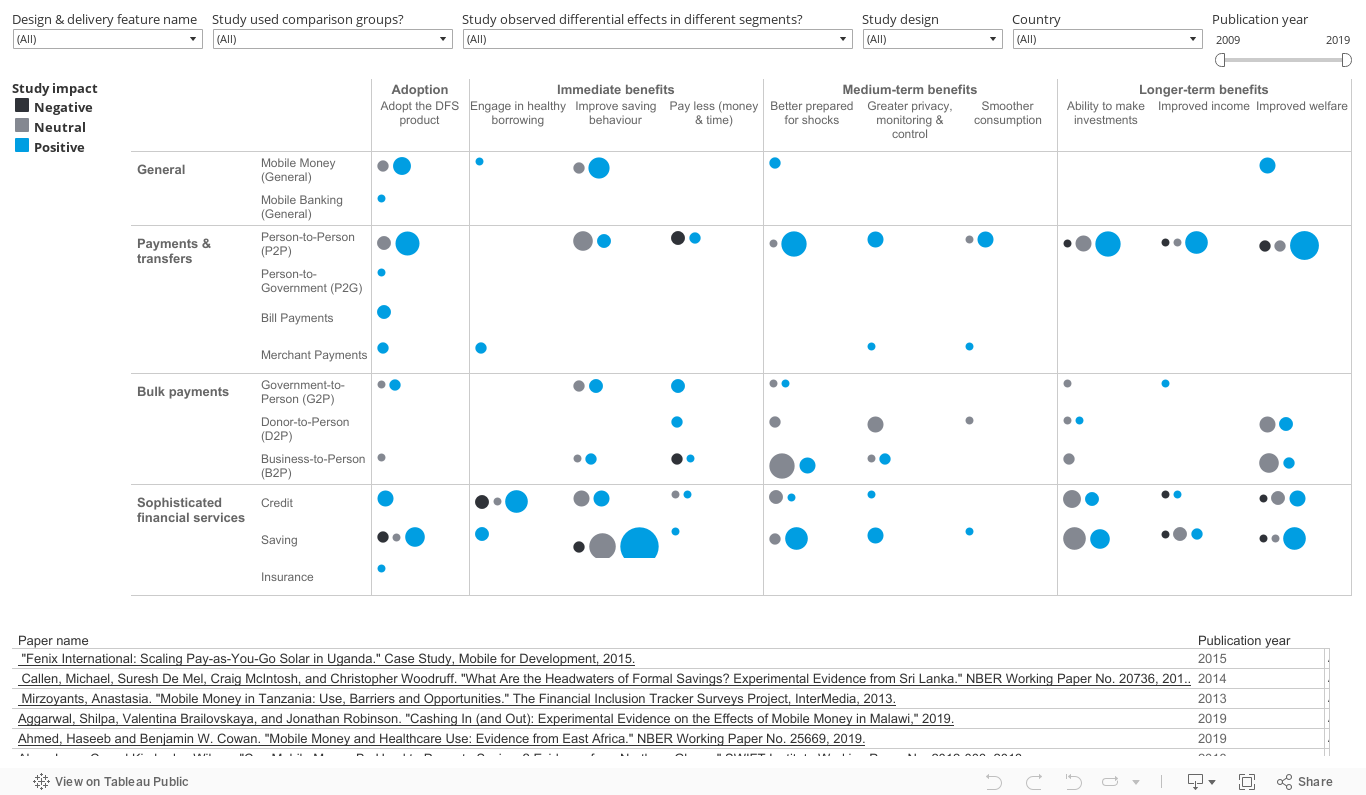
The Digital Finance Results Map presents the results of each test that was conducted on a particular client outcome. The color-coded circles show the level of impact (blue is positive, black is negative, and gray is no impact) and the number within the circle shows the number of tests on the client outcomes. Most studies tested more than one outcome, and many studies tested more than one variation on that outcome. For example, a study that tested the outcome clients improve savings behavior, may have provided results on 1) the change in frequency of saving and 2) the total value of savings. Thus, the number of tests in the results view, may not equal the number of studies. You can filter by different variables to gain a more precise picture of the impact of digital finance on various client outcomes—you can click on any circle to access further information on the studies.